This case is being updated – more materials are on the way
Add-to-order: letting customers change an order after payment
An add-to-active-order scenario for Auchan's website, mobile web and app
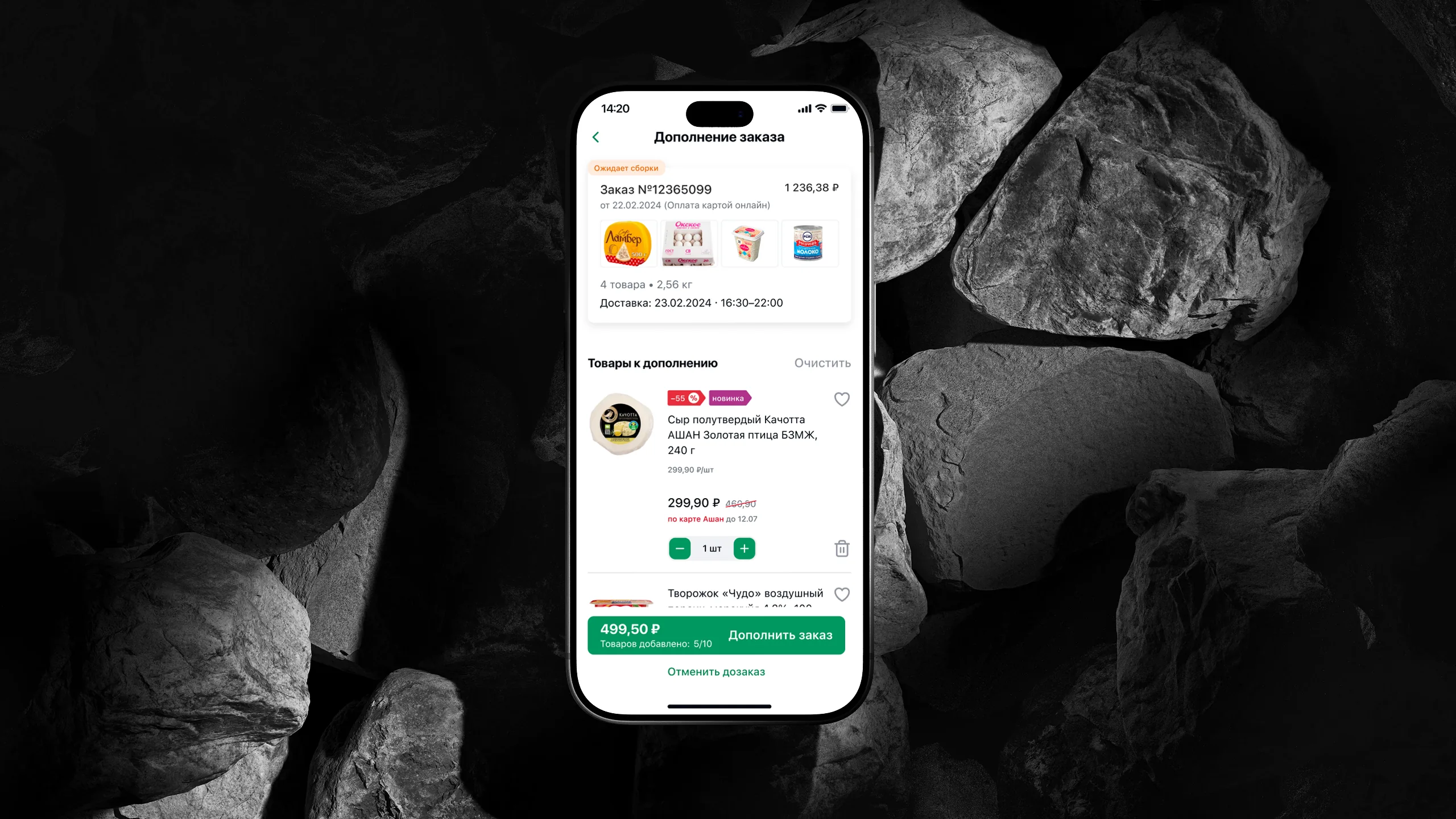
About the project
Auchan is an international hypermarket chain and one of the largest grocery retailers in Russia. For the chain, online is no longer a side channel but a significant share of the whole business: the auchan.ru website, the My AUCHAN app, delivery from hypermarkets, click-and-collect and express delivery.
The product at scale
Public figures from Auchan Retail Russia for 2023 and H1 2024
Context
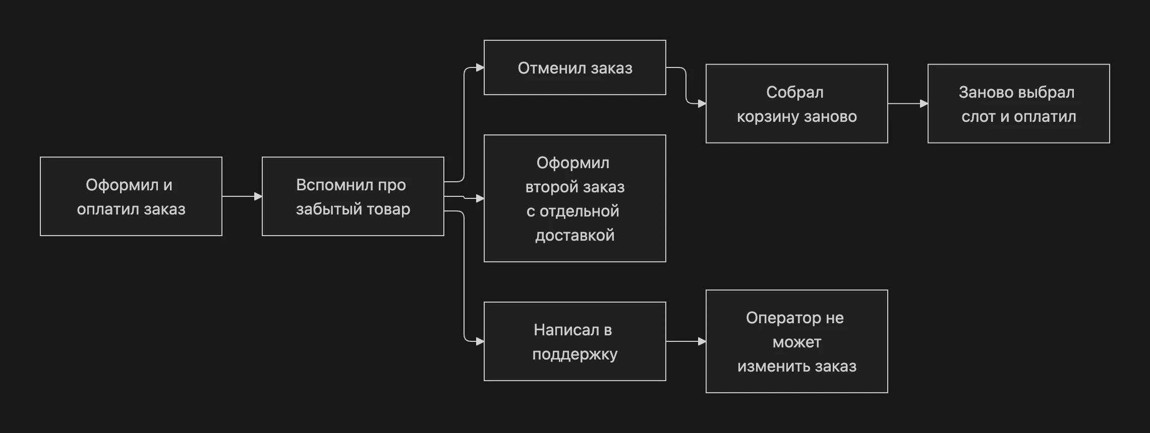
Auchan is one of Russia's largest grocery retailers, with an online store and mobile apps. Online grocery ordering is rigid: the customer builds a cart, picks a delivery slot and pays, and then the order goes to the store for picking.
Between payment and the start of picking there is a window when the order already exists, but nothing is physically happening to it yet. That's exactly when customers most often remember they forgot the milk.
Business challenge
The task came from the business – from Auchan's product managers and the head of the department. It had three sources:
Support
Regular "please add an item to my order" requests that operators couldn't resolve
Cancellations and re-orders
Customers canceled paid orders and rebuilt them just to add a couple of forgotten items
Lost revenue
Forgotten items were bought elsewhere or not bought at all
| Before | After |
|---|---|
| An order can't be changed after payment | An order can be added to until picking starts |
| Forgot an item → cancel and reorder | Forgot an item → add it to the same order and the same delivery slot |
| The issue is resolved via support | The issue is resolved independently in a minute |
| The "Thank you for your order" page is a dead end | The "Thank you for your order" page is an upsell point |
How it was
Goals and metrics
| Business goal | Product metric |
|---|---|
| More revenue per order | Average order value, share of orders with an add-on |
| Fewer lost orders | Share of cancellations before picking starts |
| Fewer "catch-up" orders | Share of repeat orders within 2 hours of the first one |
| Less load on support | Requests about changing order contents |
Objectives
- Design a new user journey for adding items to an existing order
- Show all the screens and states needed to understand the feature
- Adapt the solution for the website, mobile web and the mobile app
- Stay within Auchan's existing brand book and UI kit
My role and team
I was the Senior / Lead of aic studio's external design team. Auchan had a full product team but no in-house designers, so the design expertise and responsibility for the solution were on our side.
- Breaking down the task with product managers and translating the business goal into a scenario
- Designing the add-to-order logic and user flow
- Key screens for three platforms
- Task breakdown and reviews for two middle designers
- Defending decisions to product managers and the head of the department
- Working through constraints with developers and handoff
| aic | Auchan |
|---|---|
| Senior Product Designer / Lead (me) 2 Middle Designers Project Manager | Product Managers Head of department Analytics Frontend, backend and mobile development |
Constraints
Add-to-order is limited not by the interface but by operations: the warehouse, pickers, couriers and the payment flow. We received these constraints from the business and development teams, and they shaped almost every design decision.
| Constraint | What it meant for the interface |
|---|---|
| Items can only be added before picking starts | The scenario is tied to the "Awaiting picking" status and must end gracefully when the order moves to "Picking" |
| No more than 10 items per add-on | An always-visible "N / 10 added" counter is needed |
| Weight limit: the whole order can't exceed 65 kg | The condition has to be explained before selection starts, not as an error at the end |
| The delivery slot and address don't change | The add-on doesn't go through checkout again |
| Two payment methods with different mechanics | The final step differs for online payment and payment on delivery |
| Not every item can be added | A "This item can't be added to your order" state that suggests a similar item |
| Auchan's brand book and UI kit can't be changed | New elements are built from existing components and patterns |
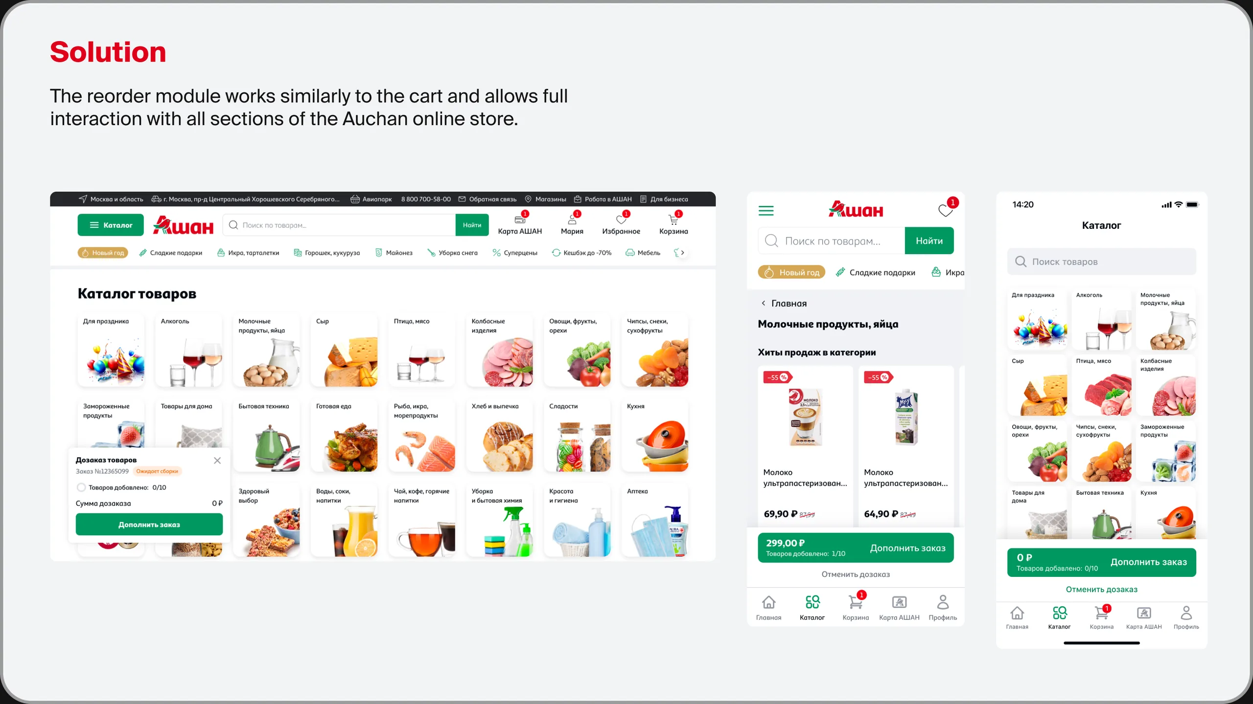
Key decision: add-to-order as a store mode
The main question was where the customer picks the items to add.
| Option | Pros | Why we didn't choose it |
|---|---|---|
| A separate screen with a curated selection of products | Quick to build | The customer is limited to recommendations and can't find what they forgot |
| The regular cart with an "add to order" label | A familiar pattern | Mixes a new order with the add-on; it's unclear where the item will go |
| Add-to-order mode across the entire catalog | The full assortment, familiar product cards and search | Chosen: harder to build, but doesn't limit the customer |
User flow
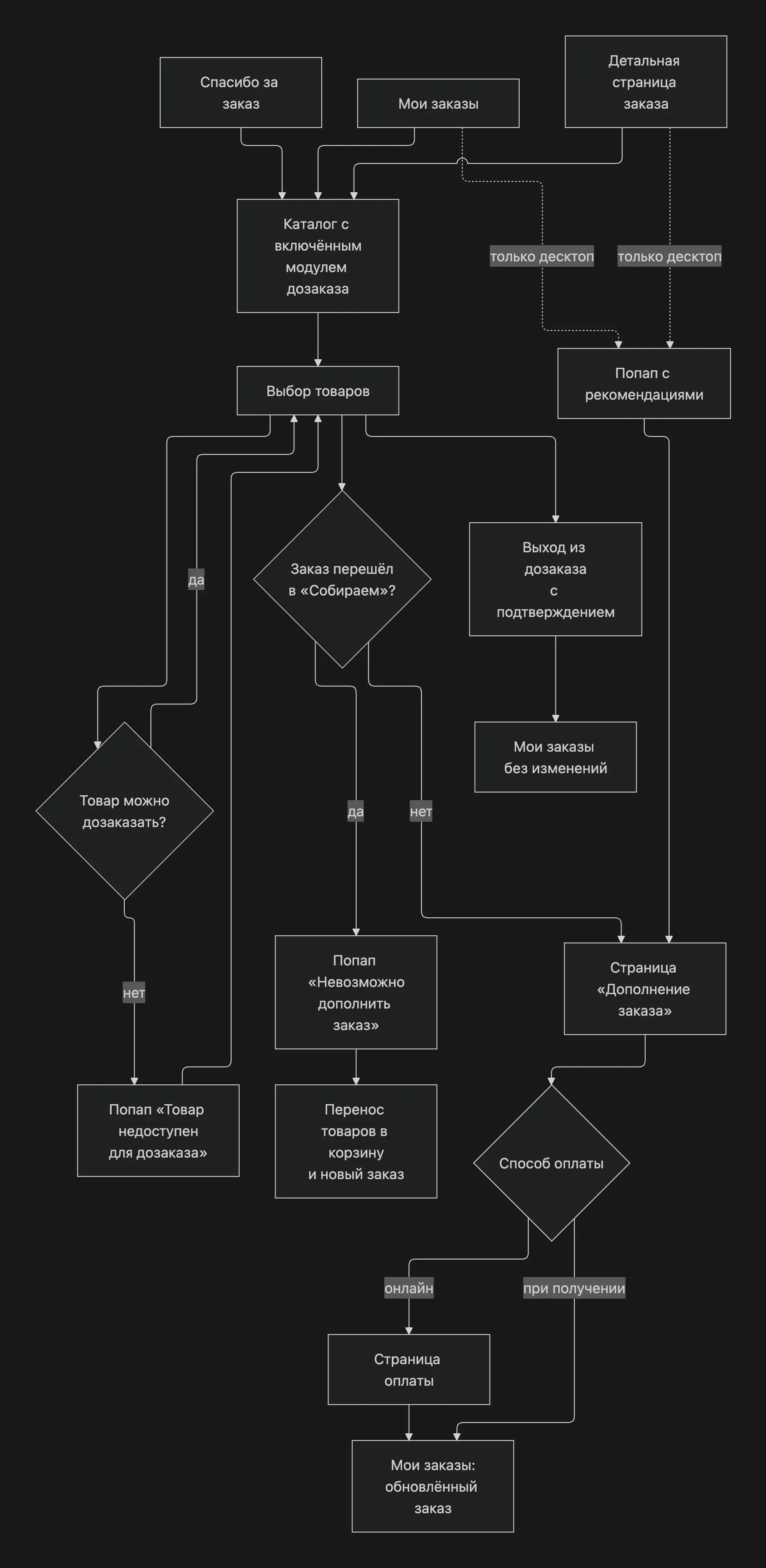
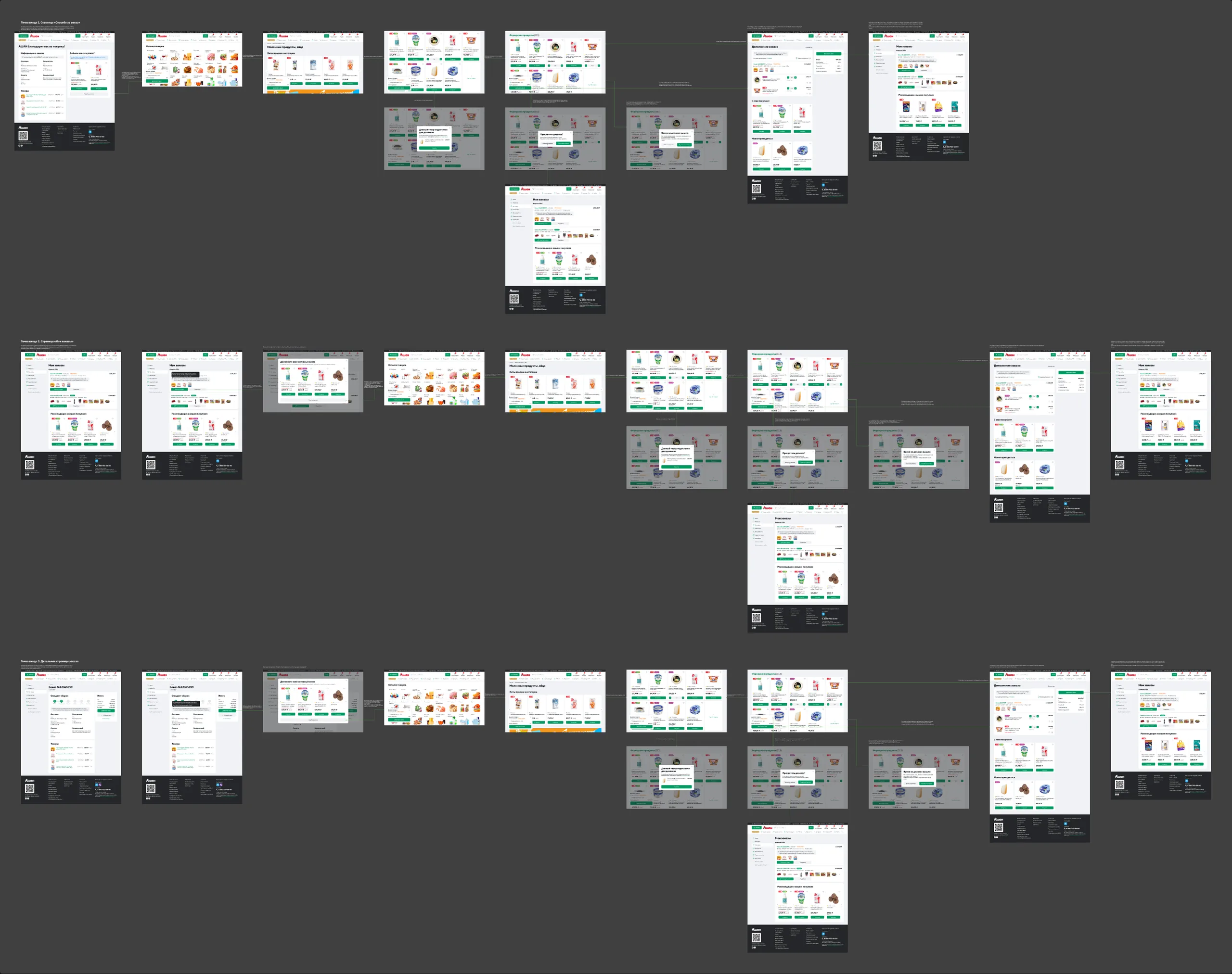
In Figma, the flow is built separately for each of the three entry points and each platform: 9 branches in total, each with the catalog, adding items, three exception pop-ups, the add-on page and the updated order.
#1. Entry points
Add-to-order should meet customers where they remember the forgotten item – not where it's convenient for us to place it.
We identified three such moments and added an entry point to each. Everywhere, the conditions are worded the same way and shown before the click: how many items can be added, the weight limit and the deadline.
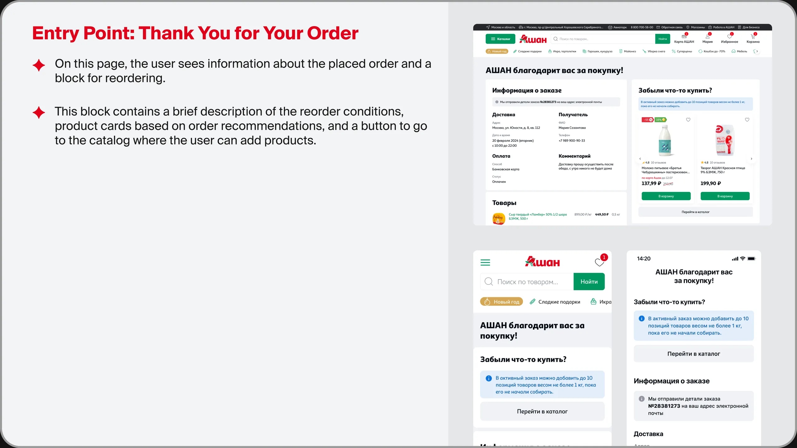
Thank you for your order
The hottest moment: the customer has just paid and still has their shopping list in mind. Next to the order information we added a "Forgot something?" block: an informer with the conditions, a recommendations slider based on the items in the order, and a link to the catalog. The screen in the mobile app is shorter, so only the informer and the "Go to catalog" button remained there.
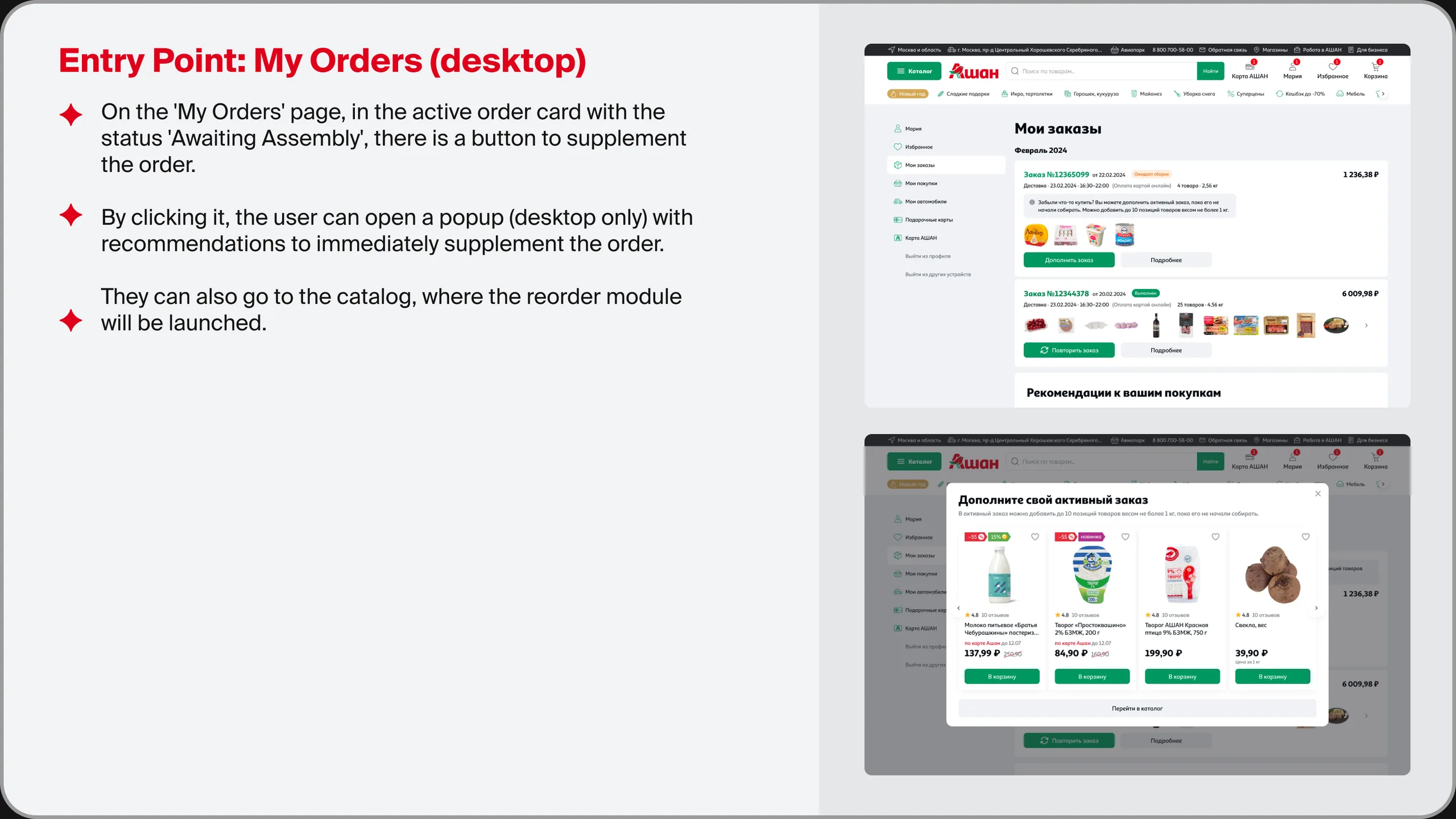
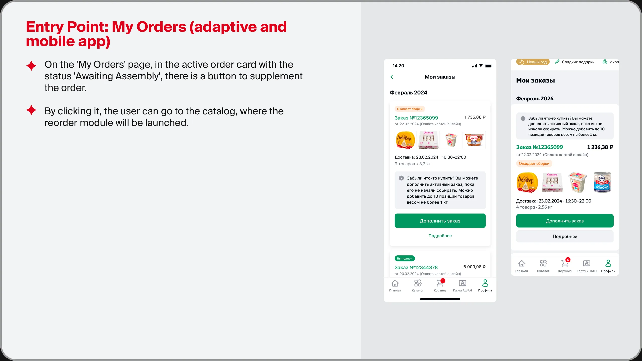
My orders
Customers come back here later, once they remember an item. Order cards with the "Awaiting picking" status got an "Add to order" button. On desktop it opens a pop-up with recommendations for quick adding; on mobile it goes straight to the catalog.
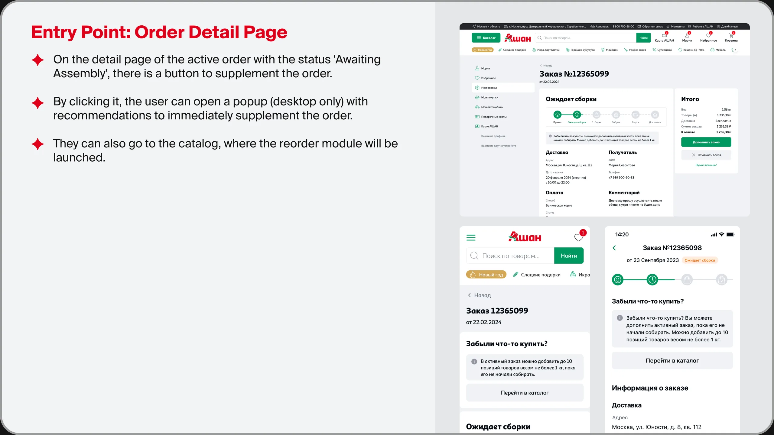
Order details page
The third entry point is for those who came to check the order status. The button sits in the "Total" block next to the amount, because adding items changes that amount.
#2. The add-to-order module
A constant companion in the catalog that answers three questions: which order am I adding to, how much more can I add, and how much does it cost.
From any entry point, the customer lands on the top level of the catalog with add-to-order mode already on, and then browses sections as usual. On desktop, the module is pinned as a floating bar in the corner of the screen; in mobile web and the app, it's built in above the navigation bar, where the cart usually lives.
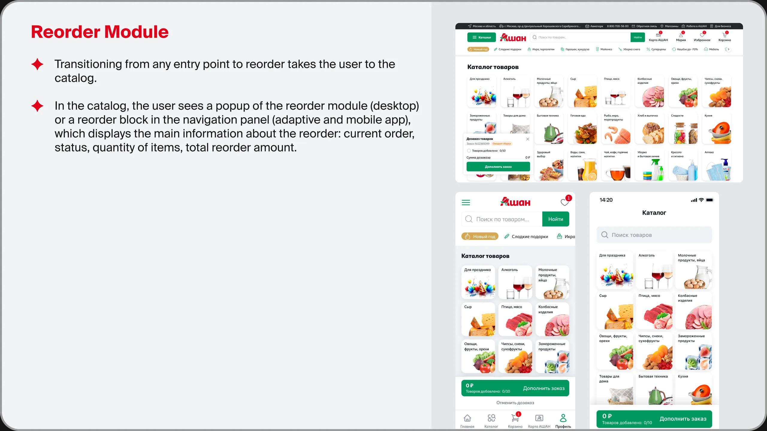
What the module shows
- Order number and status
- "N / 10" item counter
- Add-on total
- "Add to order" action
Why
- Customers don't confuse the add-on with a new cart
- The limit is visible before you hit it
- No surprises in the total at the final step
- You can finish from any page
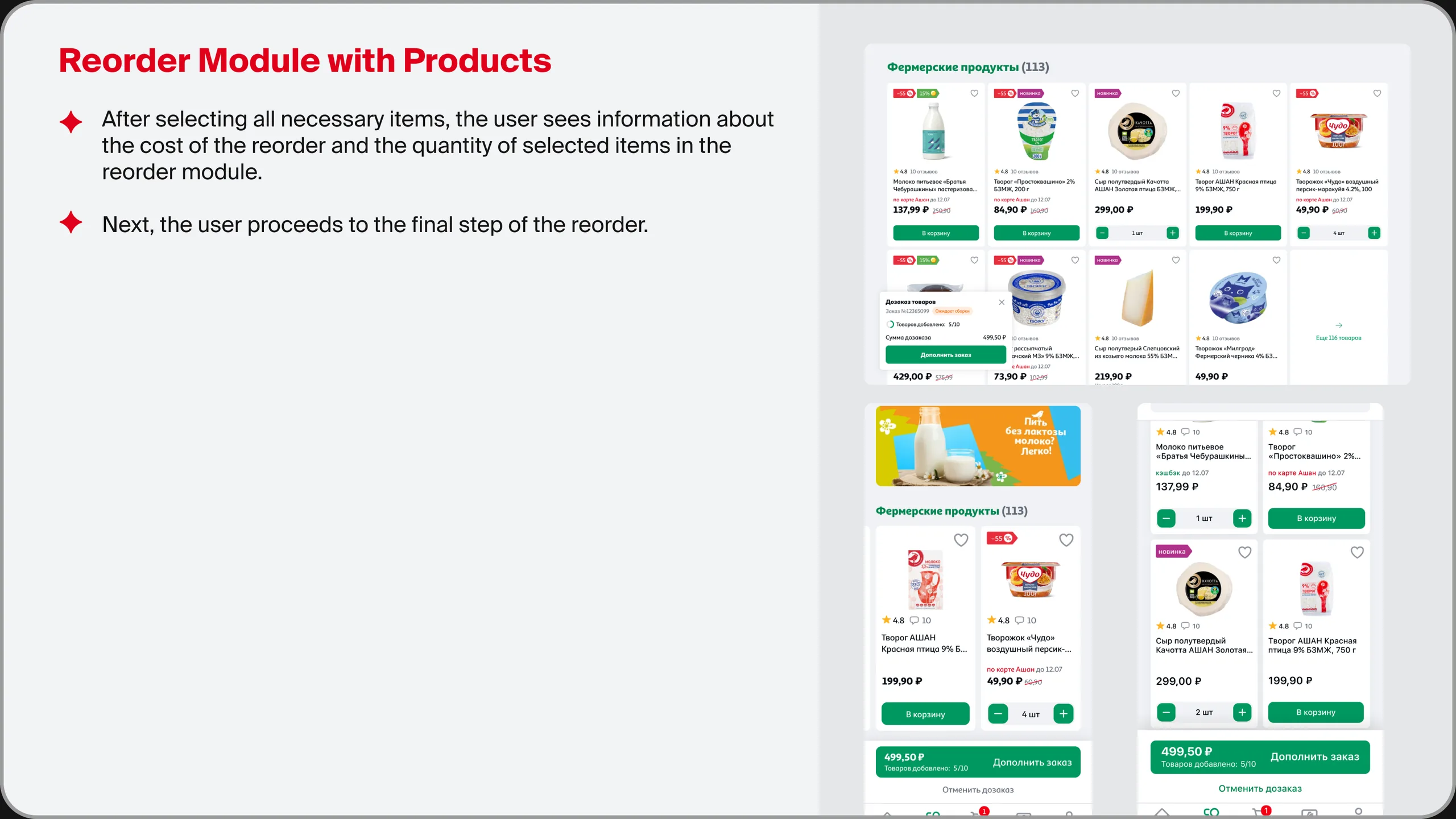
Product cards work the same way as in the regular catalog: "Add to cart", then a quantity stepper. Only the destination changes: the item goes into the add-on instead of the cart.
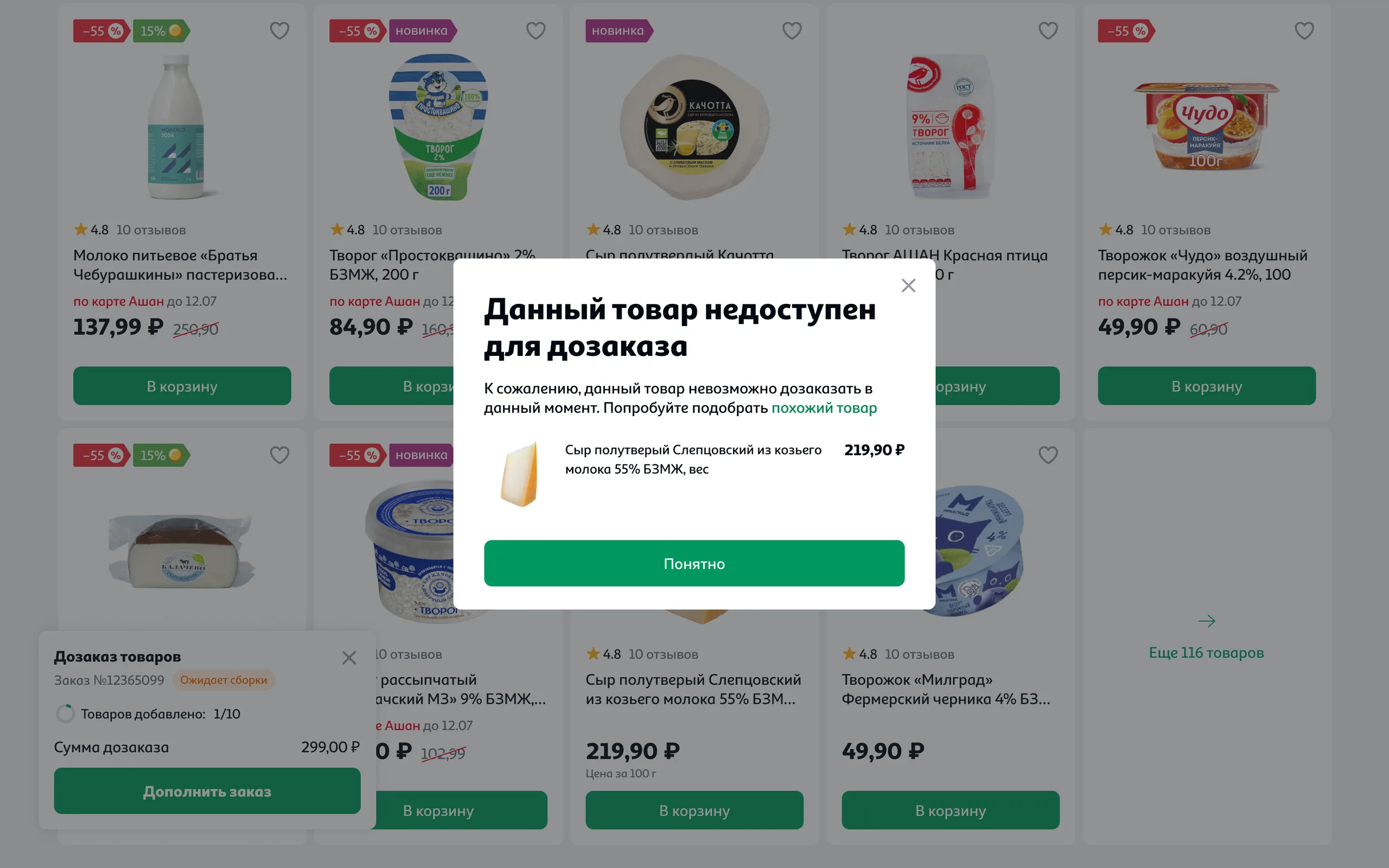
If an item can't be added right now, the customer sees a "This item can't be added to your order" pop-up right in the catalog. Instead of a dead end, the pop-up suggests a similar item that can be added straight away, and nothing already selected is lost.

#3. Confirmation and payment
Before confirming, the customer sees the original order and the added items on one screen.
The "Order add-on" page follows the cart's logic: at the top, the original order with its delivery slot; below, the added items, where you can change quantities, remove an item or clear the whole add-on; on the right, a summary with the weight and the add-on total. The "Back" button returns the customer to the catalog page they were on, so they can throw in something else.
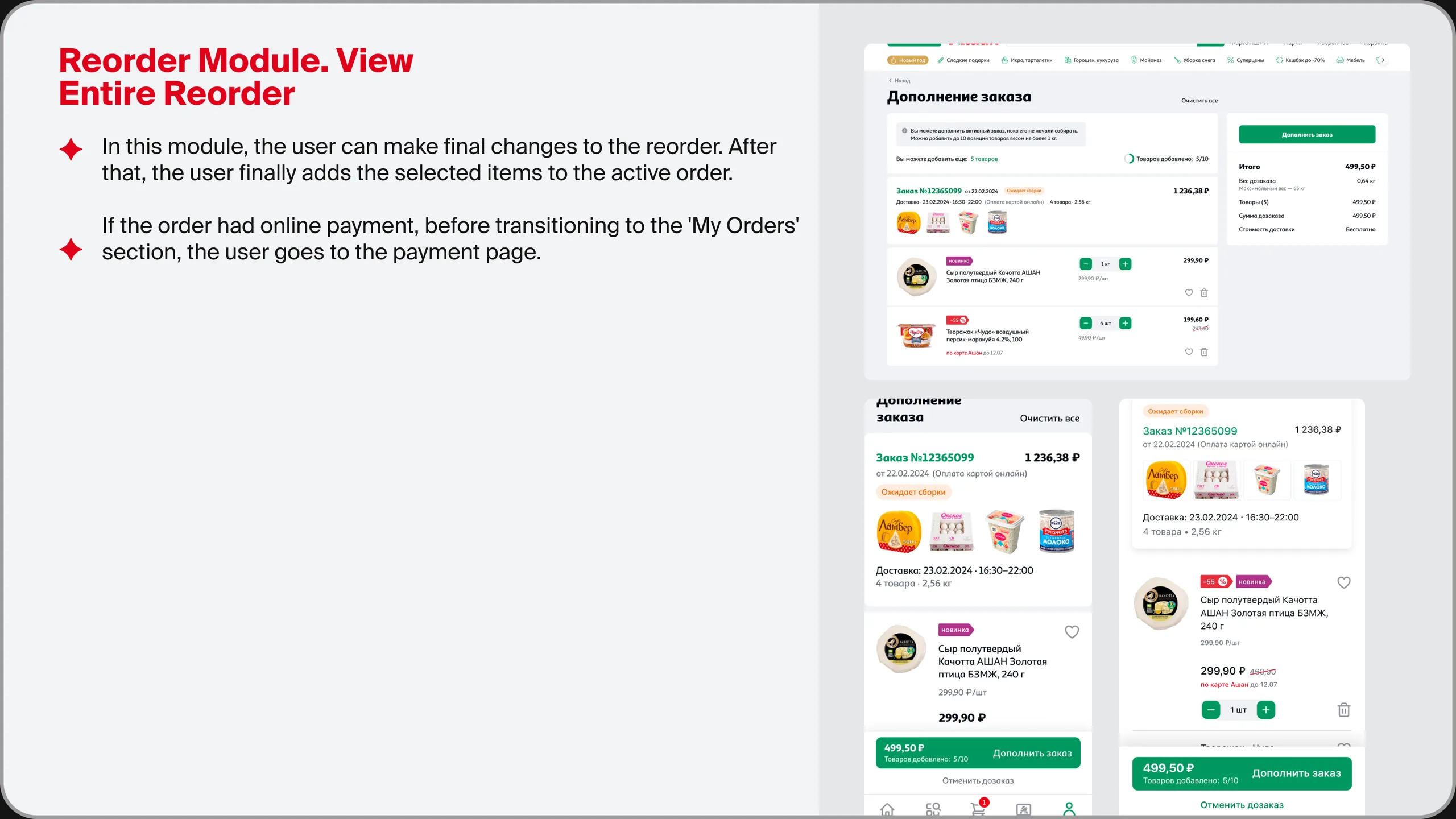
The hardest part is the money. The mechanics depend on how the original order was paid.
| Payment method | What happens | What the customer sees |
|---|---|---|
| On delivery | The order total is recalculated | The new total in the order; payment on delivery as usual |
| Online | The updated total is pre-authorized; after picking, a refund is issued and the actual cost is charged | A payment page with a clear amount, then the updated order |
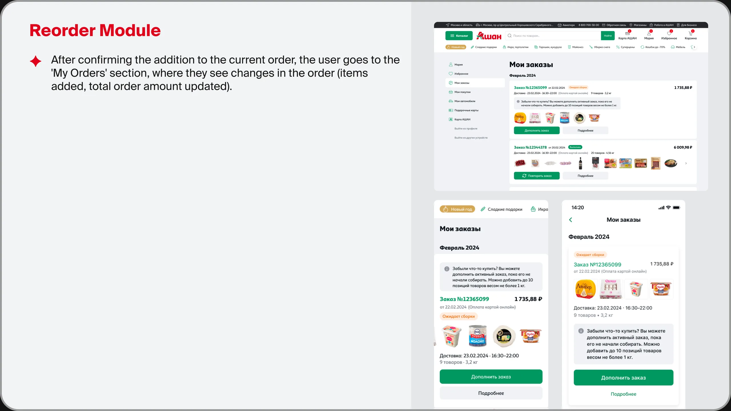
After confirming, the customer returns to "My orders" and sees the same order with the added items and the new total.
#4. Exits and edge cases
The add-on lives inside someone else's process and can end without the customer choosing to end it.
| Situation | Solution |
|---|---|
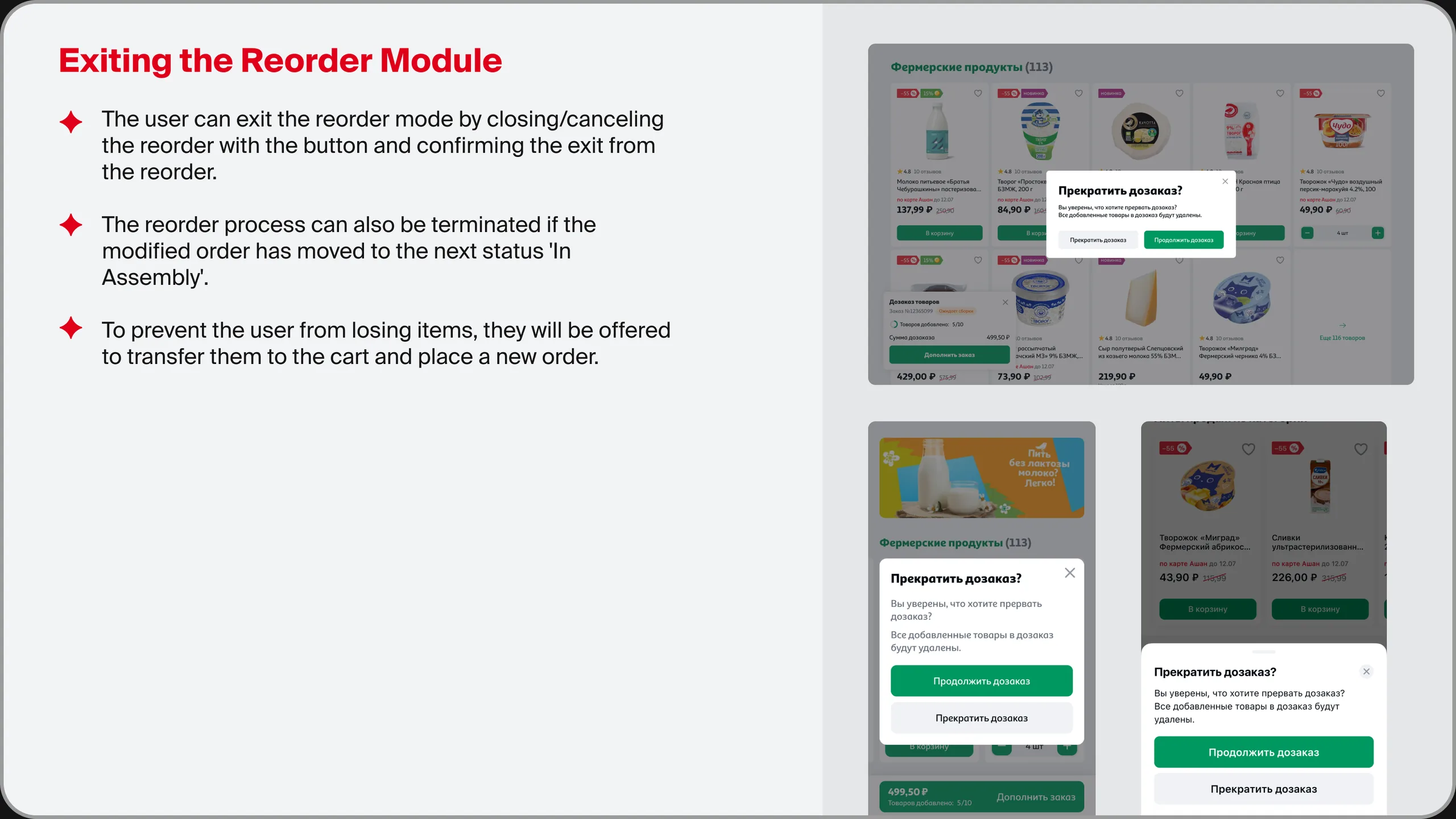
| The customer changed their mind | Exit via a button with a "Stop adding items?" confirmation. If they cancel, the customer keeps choosing; if they confirm, the items are removed and they return to "My orders" |
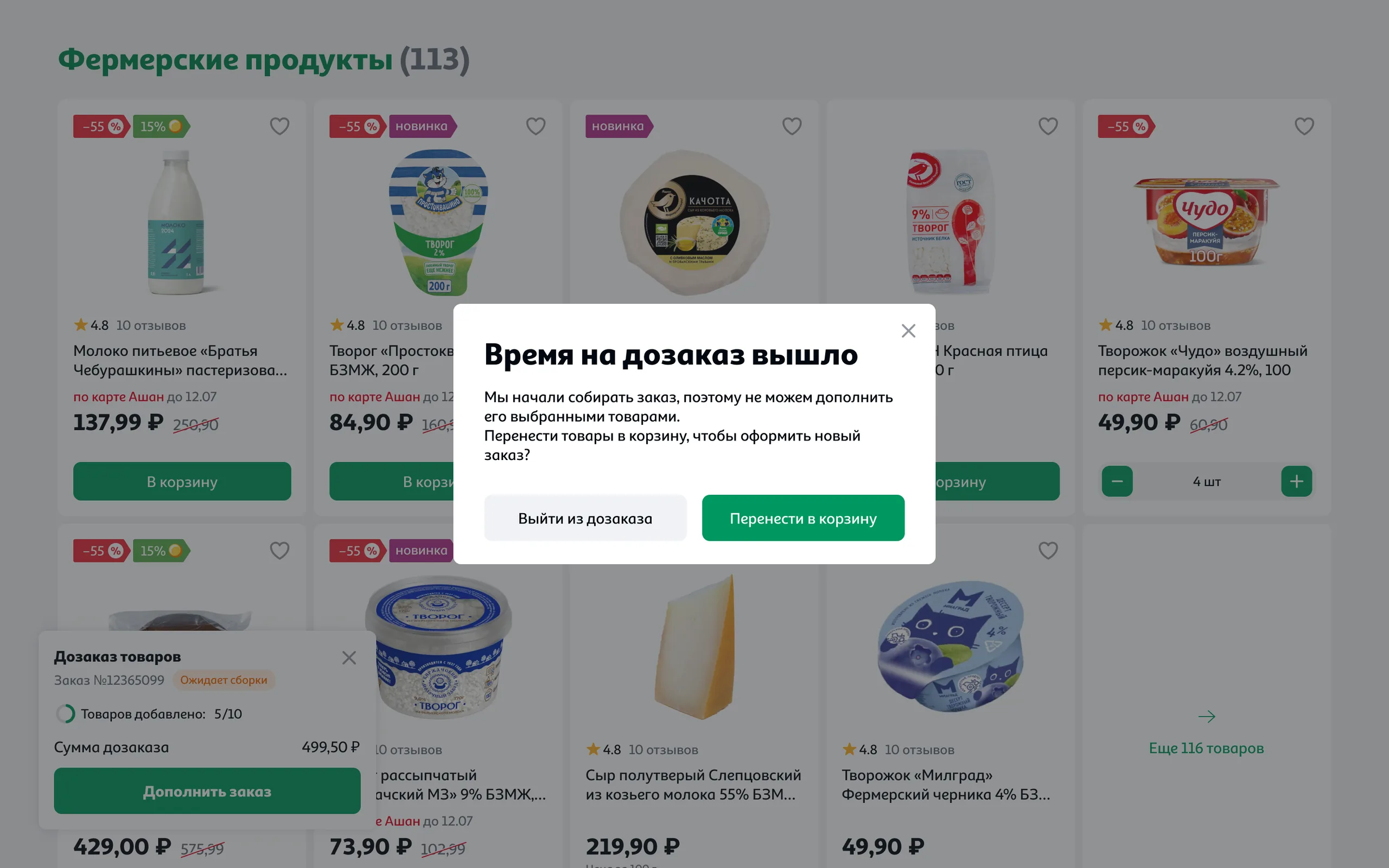
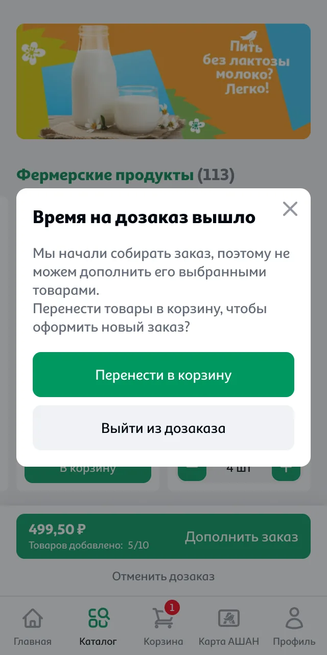
| The order moved to "Picking" while the customer was choosing | A "Can't add to order" pop-up ("Time to add items has run out" on mobile). The customer is offered to move the selected items to the cart and place a new order |
| The customer came to add to an order that's already being picked | There's no add-to-order button; a new order is suggested instead |
| An item can't be added to the order | A "This item can't be added to your order" pop-up with a similar item; selection continues |
When picking has already started, the pop-up explains why and immediately offers two ways out: "Move to cart" for a new order, or "Exit add-to-order".
Three platforms – one logic
The scenario was designed for desktop, mobile web and the app at the same time. The logic, copy and states are shared; only the way the module fits into navigation differs.
| Element | Desktop | Mobile Web / App |
|---|---|---|
| Add-to-order module | Floating bar in the corner of the screen | Block above the navigation bar |
| Quick add | Pop-up with recommendations | Direct link to the catalog |
| Exit confirmation | Modal window | Bottom sheet |
| "Thank you for your order" | Informer, recommendations slider, link to the catalog | Mobile web – same as desktop; app – only the informer and the link to the catalog |
Under the brief, the solution had to fit within Auchan's existing brand book and UI kit. The only new components were the ones specific to the scenario: the add-to-order module, the recommendations modal and the three exception pop-ups. Everything else was built from existing cards, buttons and informers.
Validation and expected results
How we validated the solution
Before development, the scenario went through internal UX reviews with product managers and developers, plus testing on a clickable prototype. I don't have access to post-launch quantitative results: Auchan's team ran the measurements after the mockups were handed off. Below is the validation plan I built into the solution.
| Stage | What we check | How |
|---|---|---|
| Before development | Whether customers understand that the item goes into the current order, and whether they notice the limits | Moderated prototype tests with 5–7 participants per platform |
| Launch | Impact on order value, cancellations and operations | A 50/50 A/B test for 3–4 weeks with a phased regional rollout |
| After launch | Which entry point works best and where customers drop off | Event funnel: entry → add → review → confirm |
What the team expected
Target benchmarks estimated by the team at the design stage, not measured results.
Stakeholders and development
Final decisions were made by Auchan's product managers and head of department, while the design expertise sat with the studio. That meant arguing every decision in terms of the business task, not taste.
- Presented options with their pros and implementation cost, rather than one "right" design
- Discussed every warehouse and payment constraint with developers first, and only then designed
- Designed edge cases together with the main scenario, not after it
Process: brief from product managers → scenario and constraints → options → review → mockups for three platforms → handoff → design support during development
The handoff included the module's states, the copy for the conditions, rules for each order status and annotations for the payment branches.
What I would do differently
Metrics from the start
I would agree with the client's team upfront on access to post-launch results, so I could see the solution's impact and not just the mockups.
Test earlier
I would test the main risk – confusing the add-on with a new cart – on a prototype before detailing all three platforms.
A wider add-to-order window
I would work with the operations team on adding items during picking, for products from store zones the picker has already passed.